Hacker Relay
Delivering clear, actionable insights that empower talent to understand their career readiness and close the gap to opportunity to over 10,000 users

Background
Hacker Relay closes the gap between talent and opportunity by delivering clear, actionable insights—empowering candidates to understand their readiness and take the right steps to level up.
Since joining the team, I had the privilege to lead design initiatives and build the product roadmap alongside the founder. Key projects I shipped include a robust dashboard, analytics, personalized onboarding and a circular user experience that keeps users engaged and loving our platform.
Context
The Team
1x Product Designer (Me)
1x Developer
1x Founder
February 2025
I led the new brand design direction.
March 2025
I led the new brand design direction.
April 2025
I led the new brand design direction.
May 2025
I led the new brand design direction.
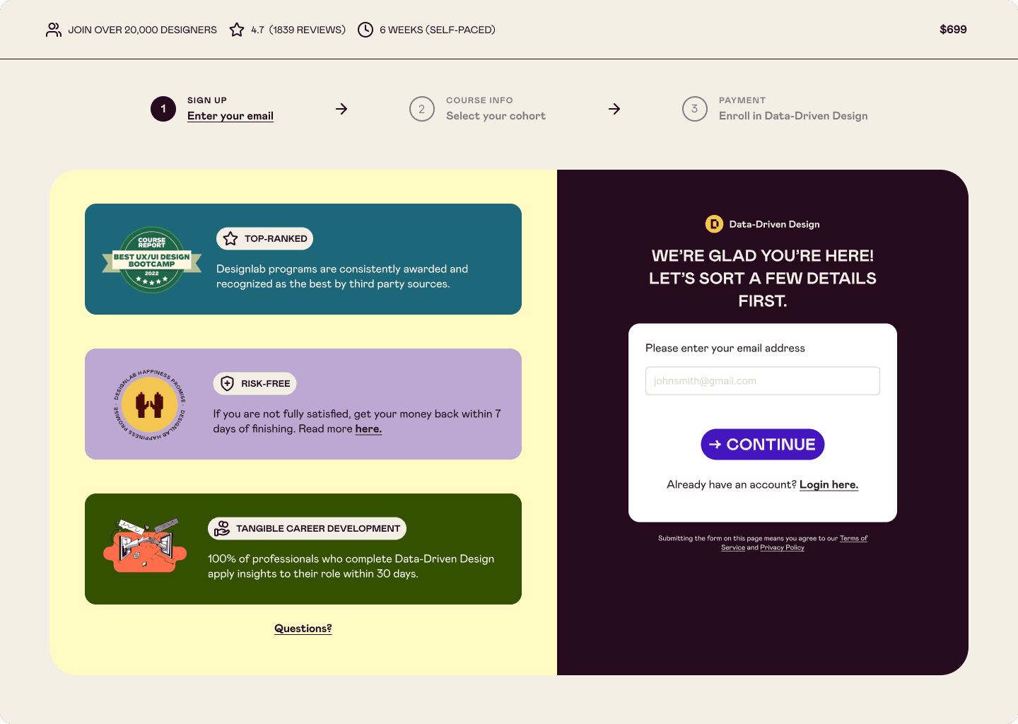
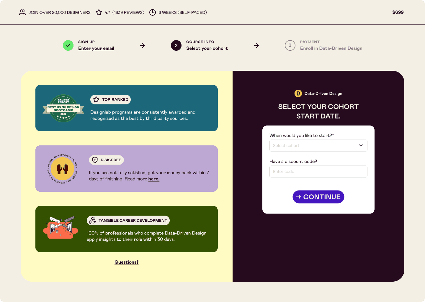
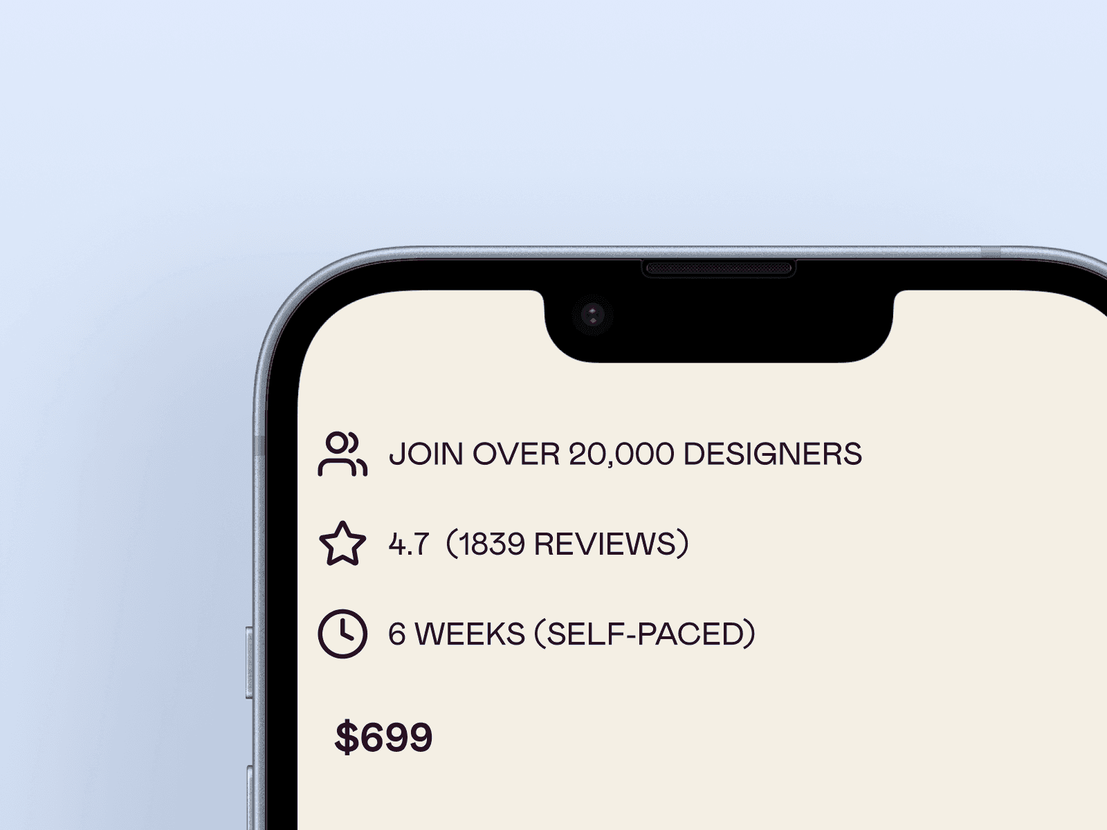
Less clutter & clear information
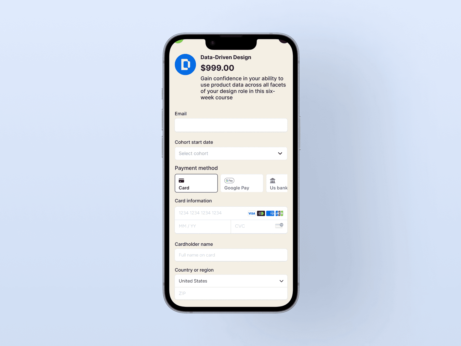
More than half of our traffic are from mobile devices, it was critical to examine how to improve design here.
The biggest improvement was removing unnecessary padding and prioritizing breathing room to present only key information.
Overall, improving readability, content visibility, and accessibility.

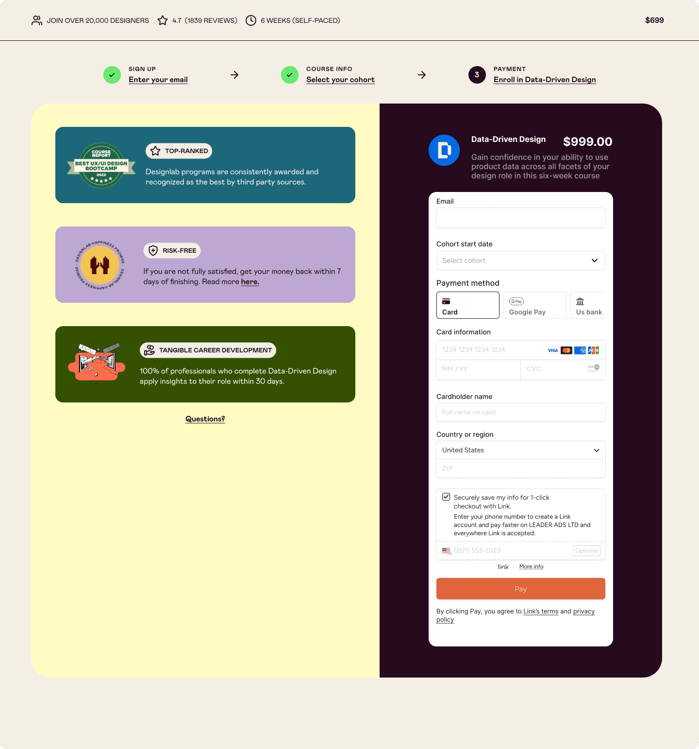
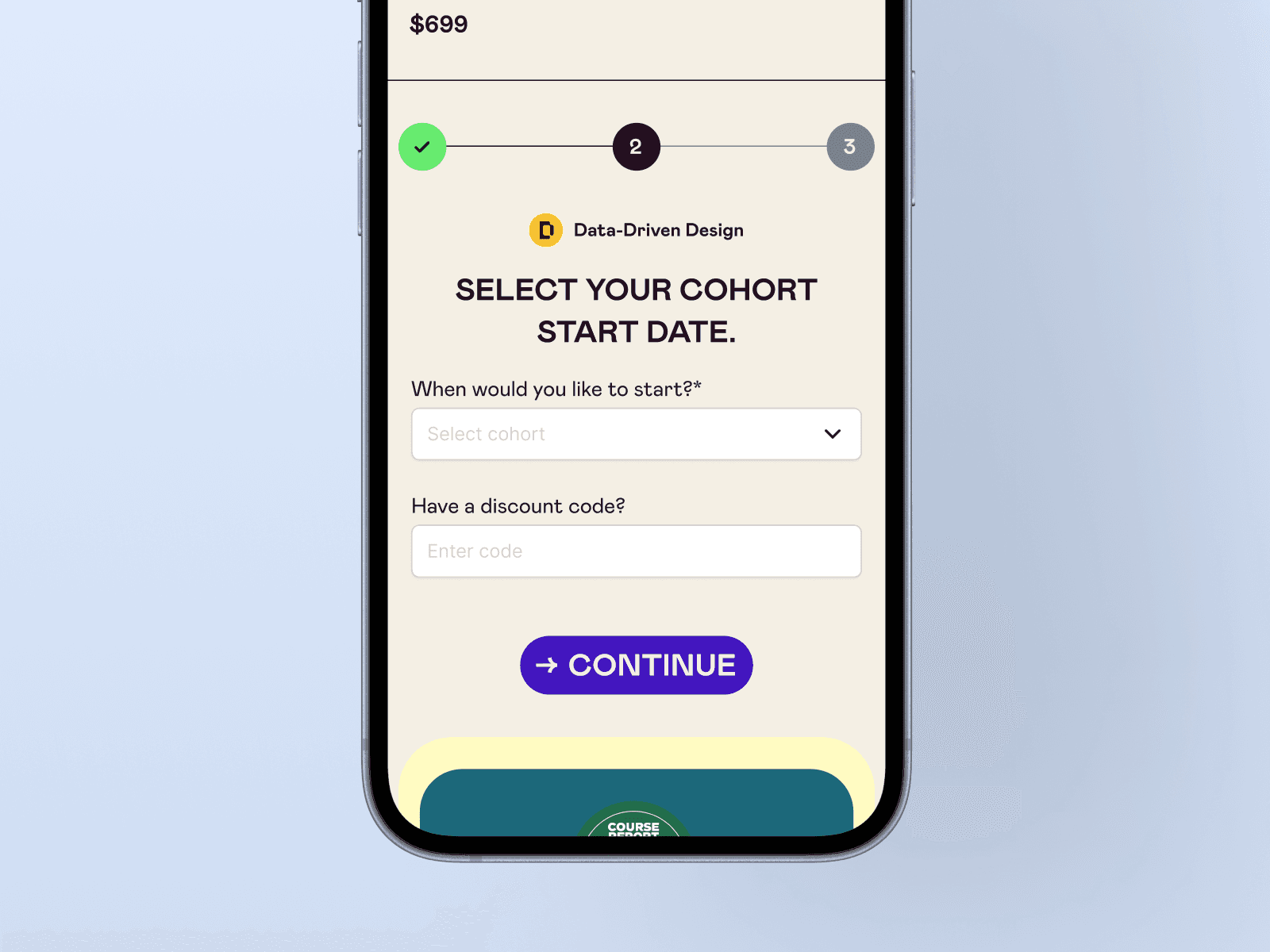
Frictionless payments
We are capturing payments via Stripe, so there wouldn't be any design exploration here. However, implementing third party payments was intentional due to high mobile traffic versus desktop.
Doing so led to a more frictionless option for users when they are at checkout and may not be near their wallet - decreasing potential rates of abandoned carts.

Reassurance in privacy, safety, and quality
When enrolling into a program, users want to feel that they are going to be taken care of and that they choosing the right program out of a dozen others.
If users were viewing from a MacBook Air or Pro (13-inch), supporting content were hidden/cut off from the screen.
Reorganizing content that emphasizes course credibility and quality throughout the checkout process can ease user apprehension and encourage enrollment completion.

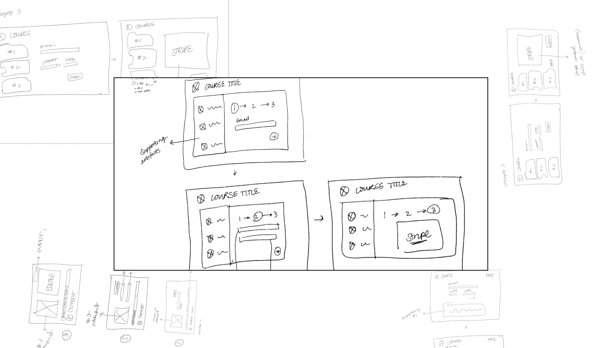
Behind the scenes…


Impact
Within one month of launching the new design, we achieved a 22%* boost in enrollment. We saw a significant jump in conversion rates at the first step of the user journey—critical for our marketing team to capture leads and drive follow-up efforts.
The momentum hasn't stopped there—our team continues to see growth in both enrollment numbers and valuable lead generation.
*For confidentiality reasons, actual values for metrics have been omitted
© 2025 Candace S Wu
© 2025 Candace S Wu