
Background
Designlab offers industry-leading programs that combine expert mentorship and personalized feedback with the flexibility of online learning.
Context
The Team
1x Product Designer (Me)
1x Sr. Front-End Developer
1x Head of Engineering
1x Founder
Why an Improvement?
While we were seeing traffic on our enrollment page, we were experiencing a lack of completion in:
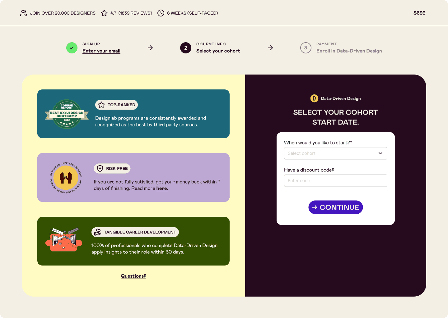
1) Account Creation
2) Enrollment
Account Creation being a critical touchpoint for our team to follow-up with users who expressed interested, but did not complete enrollment.
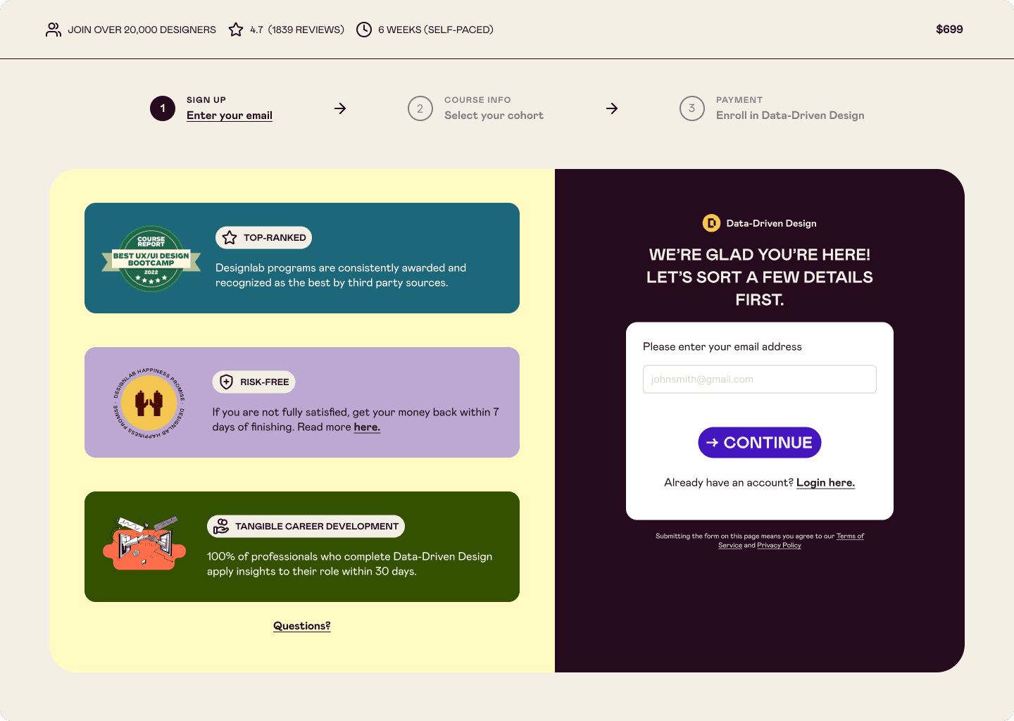
Defining
How might we enhance the registration process to motivate individuals to enroll in online courses?
Impact
Within one month of launching the new design, we achieved a 22%* boost in enrollment. We saw a significant jump in conversion rates at the first step of the user journey—critical for our marketing team to capture leads and drive follow-up efforts.
The momentum hasn't stopped there—our team continues to see growth in both enrollment numbers and valuable lead generation.
*For confidentiality reasons, actual values for metrics have been omitted
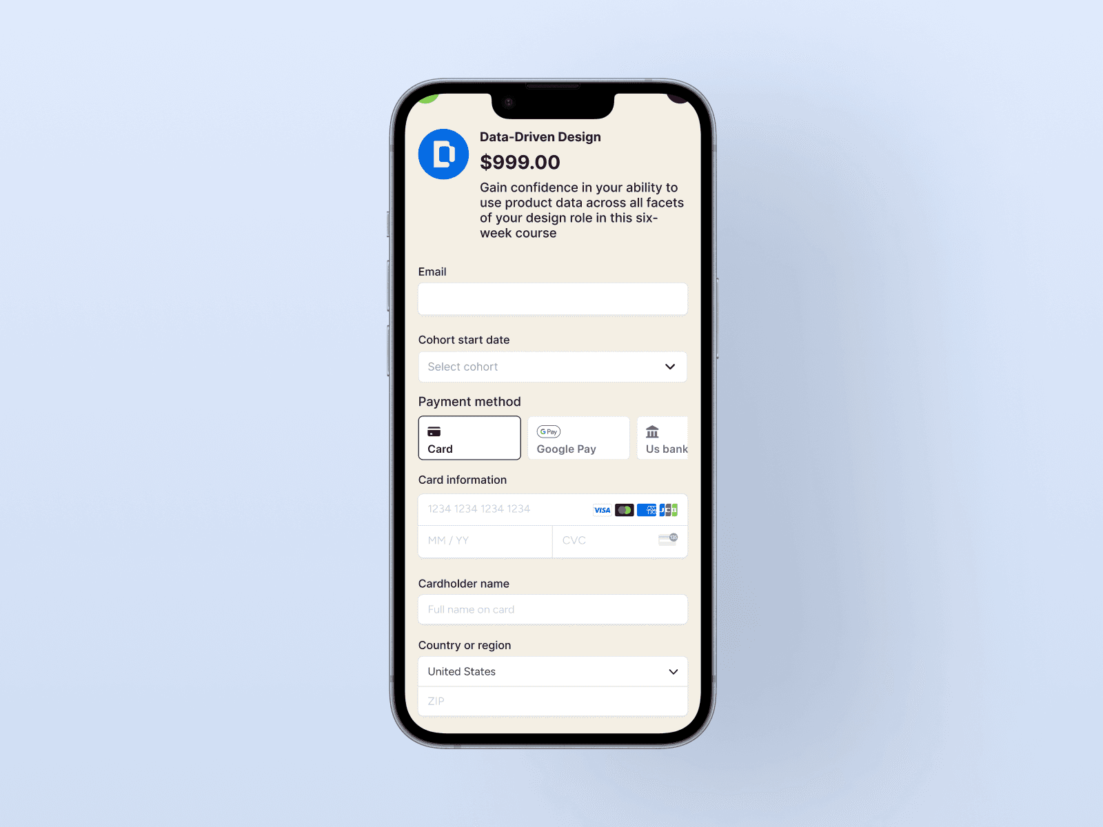
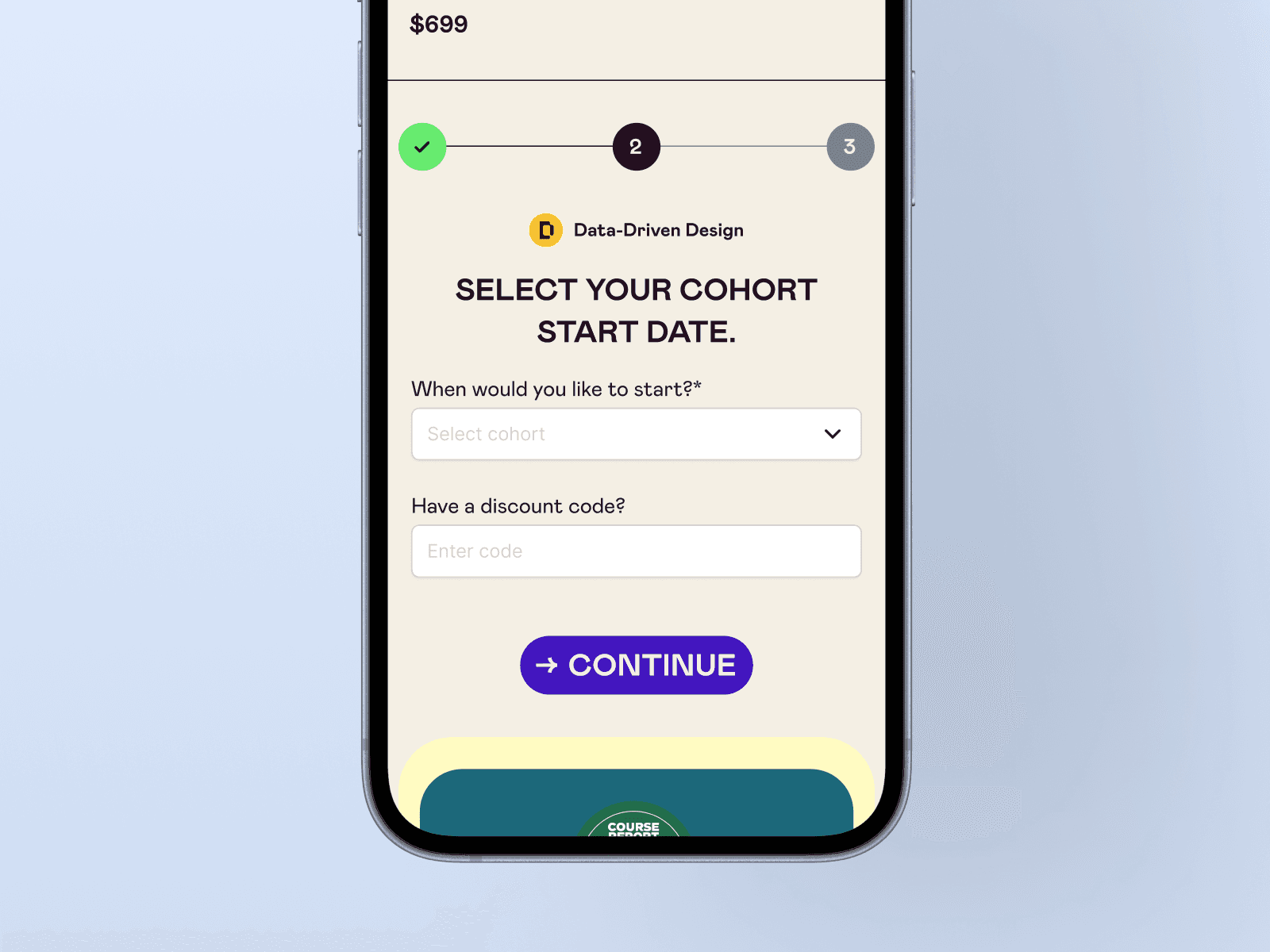
Optimize mobile view
Since over half of our traffic comes from mobile devices, it was essential to optimize the mobile design. I removed unnecessary padding and focused on creating breathing room, highlighting only the most important information.
The result: better readability, improved content visibility, and enhanced accessibility. I attribute our spike in email captures to this redesign.

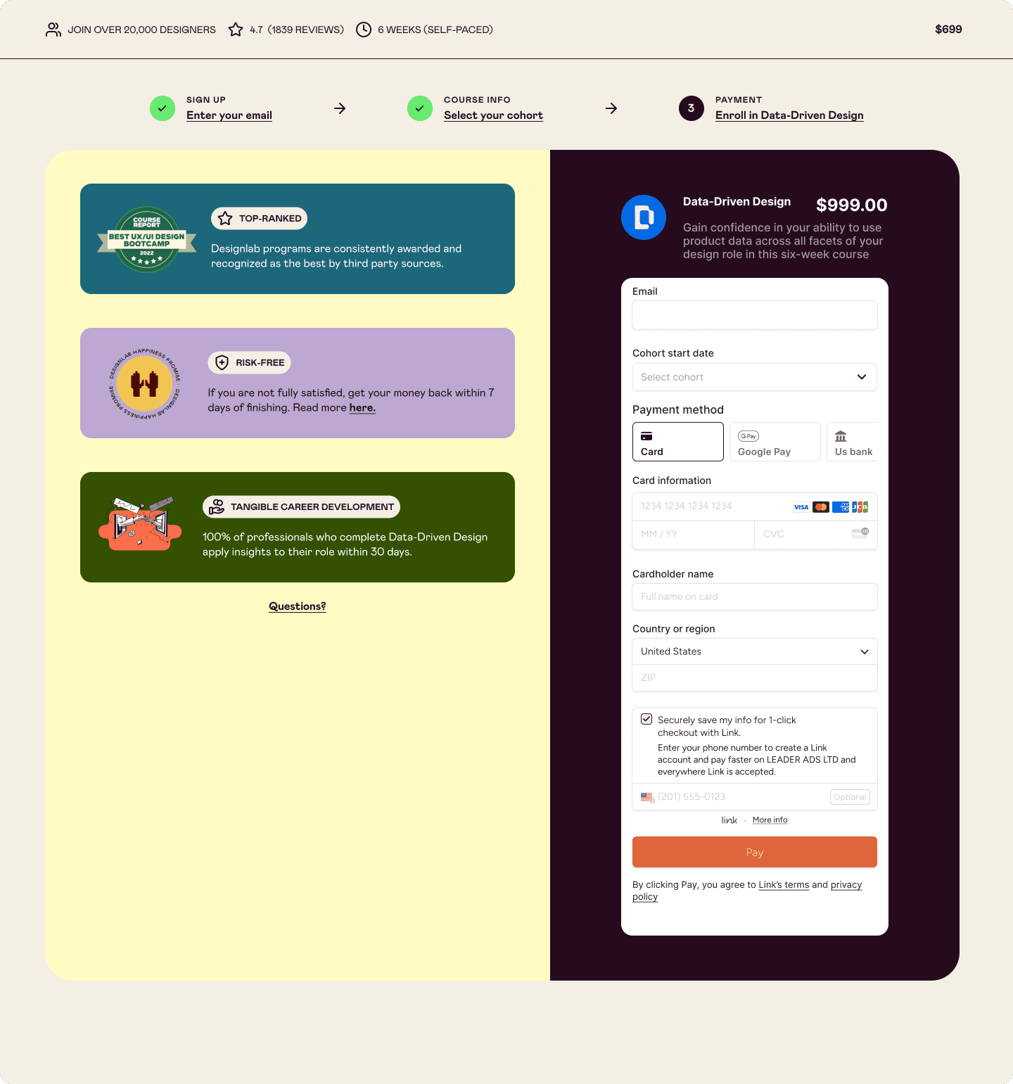
Frictionless payments
We use Stripe to handle payments, so no design exploration was needed here. I chose to integrate a third-party solution, driven by our high mobile traffic.
The result: Offering a more seamless checkout experience—especially for users who aren’t near their wallets—helping reduce cart abandonment.

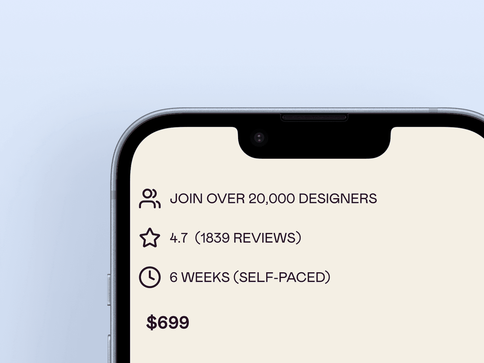
Reassurance in privacy, safety, and quality
When enrolling in a program, users want reassurance that they’re making the right choice. On 13-inch MacBook Air and Pro screens (or smaller), key supporting content was hidden or cut off, which could undermine confidence.
I reorganized the layout to highlight course credibility and quality throughout the checkout process
The result: Reduce user apprehension and increase enrollment completion.

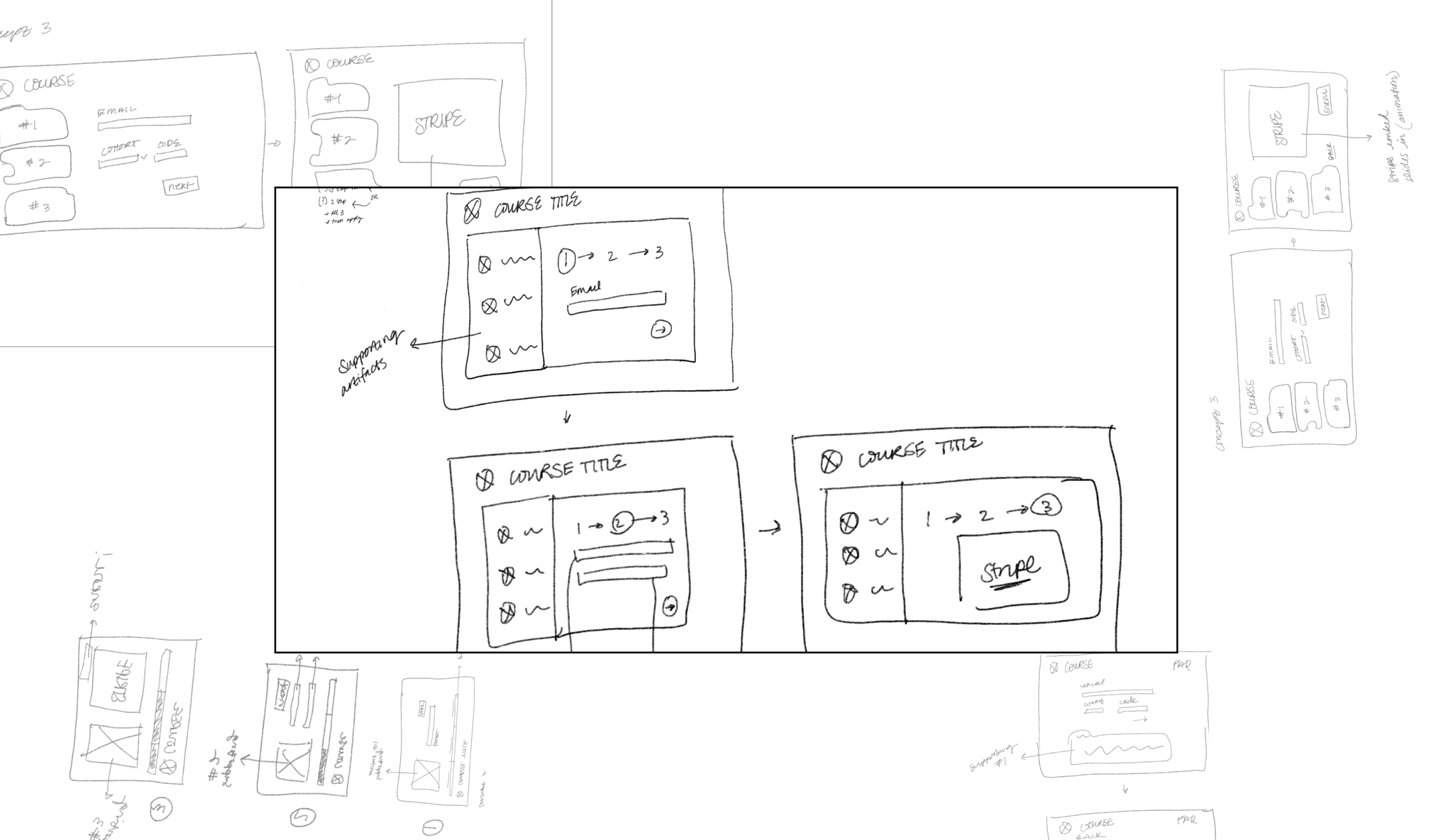
Behind the scenes…


Impact
Within one month of launching the new design, we achieved a 22%* boost in enrollment. We saw a significant jump in conversion rates at the first step of the user journey—critical for our marketing team to capture leads and drive follow-up efforts.
The momentum hasn't stopped there—our team continues to see growth in both enrollment numbers and valuable lead generation.
*For confidentiality reasons, actual values for metrics have been omitted