
Background
Dovly is one of the fastest-growing SaaS product that has attracted many various fintech company partners such as Chime, Moneylion, Varo, and Credit Sesame. We are the first automated credit engine that fixes, manages, and maintains credit scores.
Context
The Team
I was the sole designer for the overhaul of the Dovly landing page. I collaborated with the VP of Marketing, VP of Product, an Illustrator, and one Developer.
Why an Overhaul?
There are 43,810 credit repair services in the US as of 2023; Dovly was blending in with the market.
Many of the competitors' websites and verbiage was giving a "copy and paste" feeling offering no unique approach to the industry.
The Goals
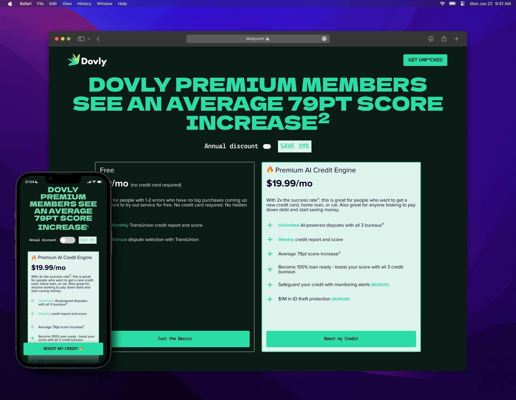
Communicate Dovly's unique value proposition to millennial and gen-z markets
Take previous brand content and copy and reframe them to be "edgy" and "relatable" - invoke a feeling
Drive user engagement and premium member sign-ups
Defining
How might we engage and excite the millennial and gen-z markets to take control or rebuild their credit scores to help them achieve life milestones?


Branding Refresh
I met with the VP of Marketing to discuss potential brand directions for Dovly.
We collaborated and ideated different concepts, conducted competitive analysis, and collated various mood-boards to envision the vast opportunities.
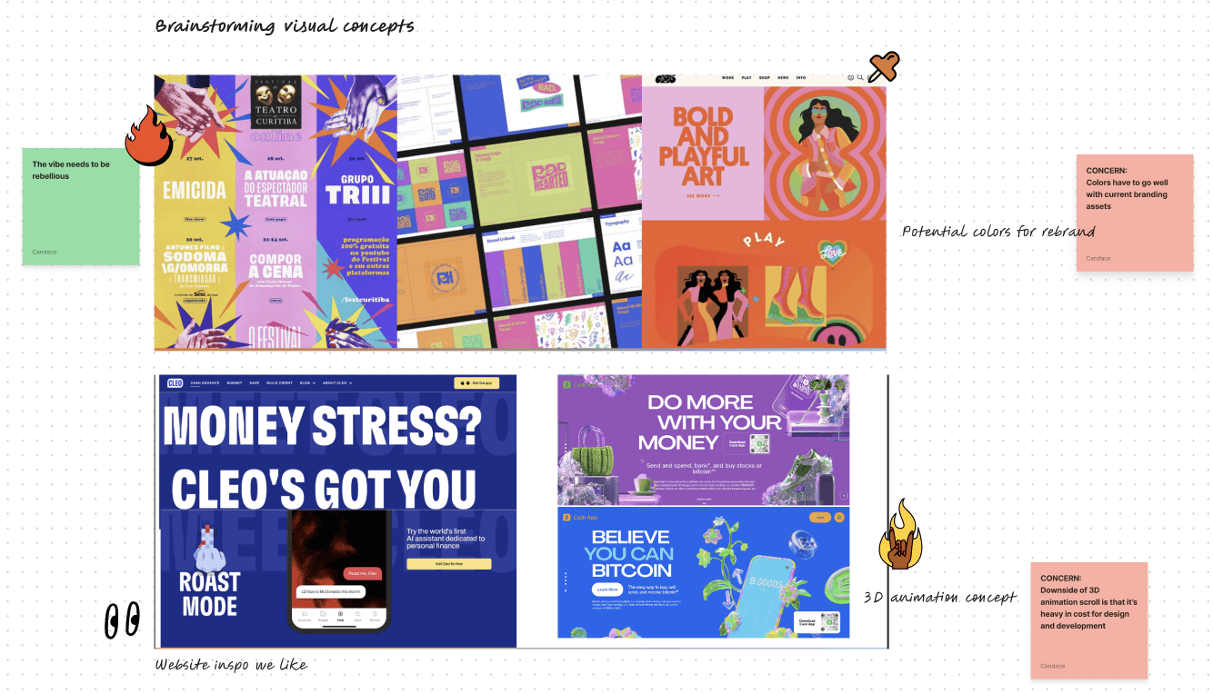
Going Bold
After brainstorming and aligning the team on an overall general direction, I began roughly designing concepts. I combined different colorways, fonts, and graphics.
The focus was not to nail the content within these ideations, but rather invoke a feeling. Did we want to go "Sleek," "Fun," or "Bold"?
This was a vital turning point in team alignment and visual branding.

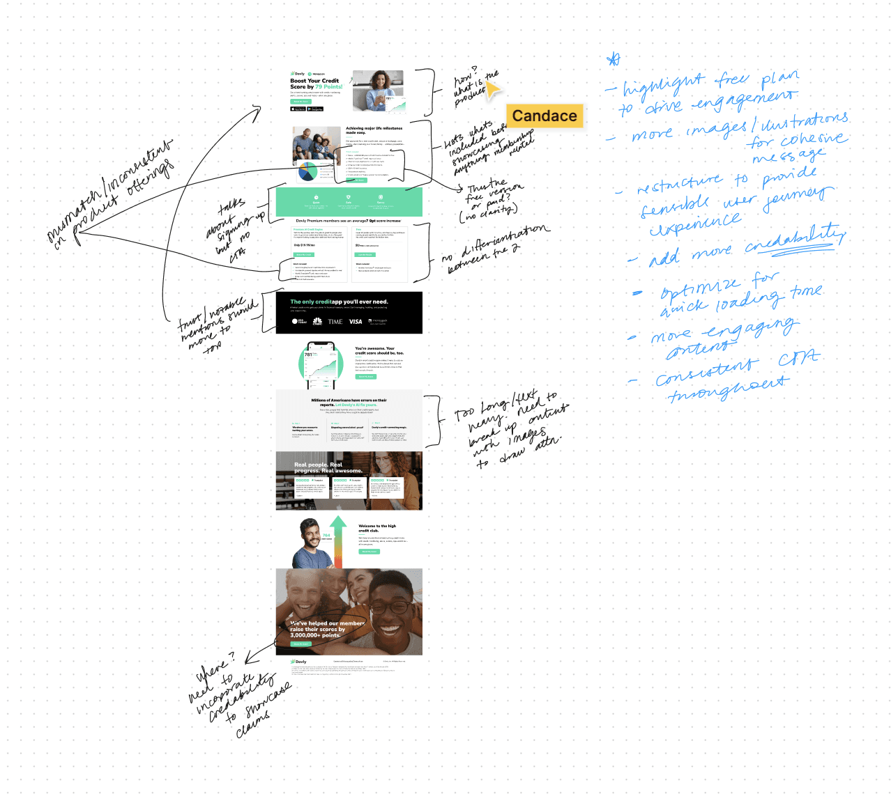
What Was Wrong in the First Place?
According to American Express, the average credit score for ages 18-24 is 679.
Before designing, I set out to complete an audit of the current landing page.
Key concerns:
Does not clearly indicate how or what
Inconsistent verbiage
Missing opportunities of building trust/credibility
Lackluster/no emotional connection or pull
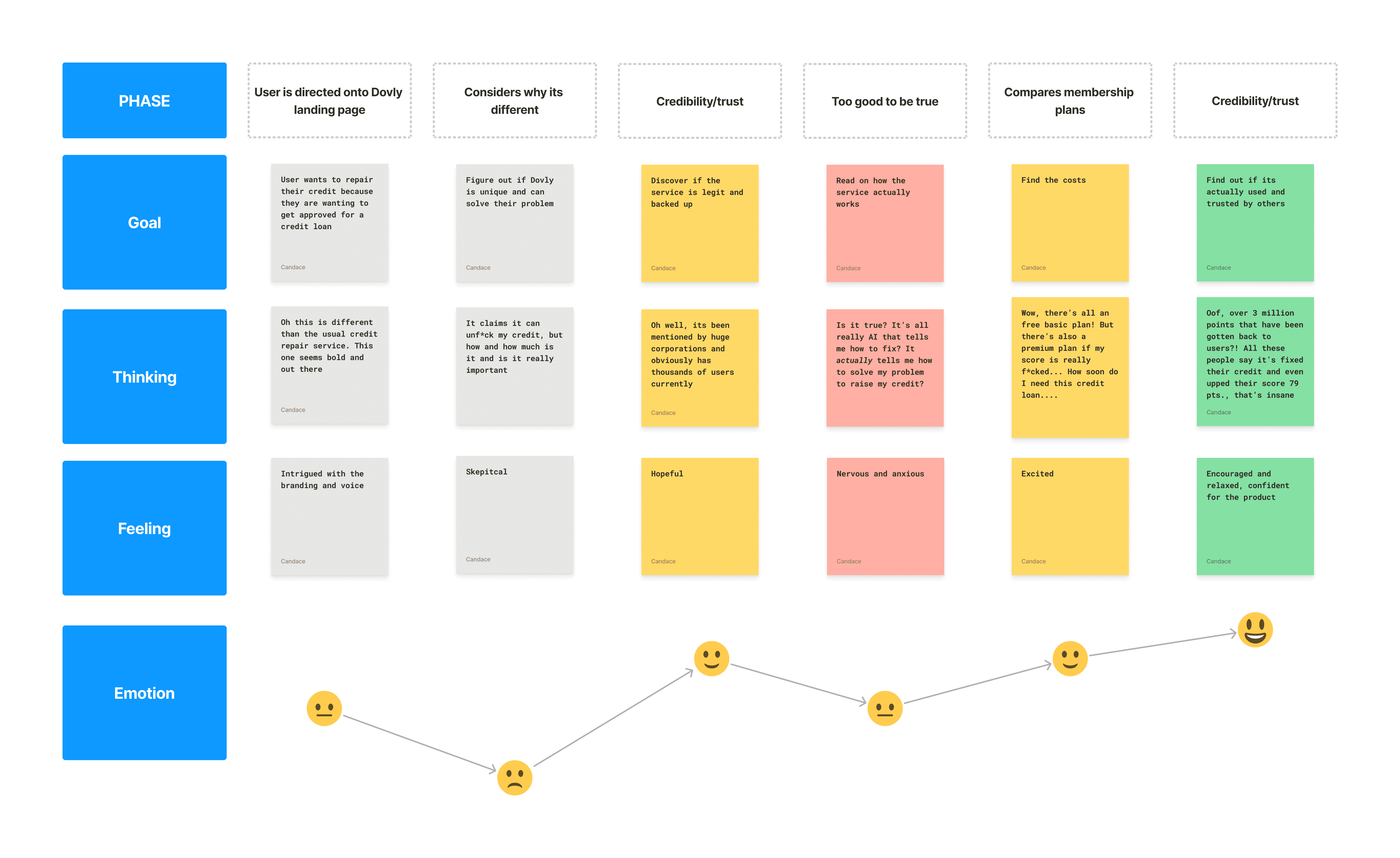
An Emotional Rollercoaster
It can be a complex process of endless decision-making that users aren't prepared to handle as it heavily influences one's financial well-being and future prospects.
It was important to produce a customer journey map so I could then use this information as a light guide for the structure of our content.
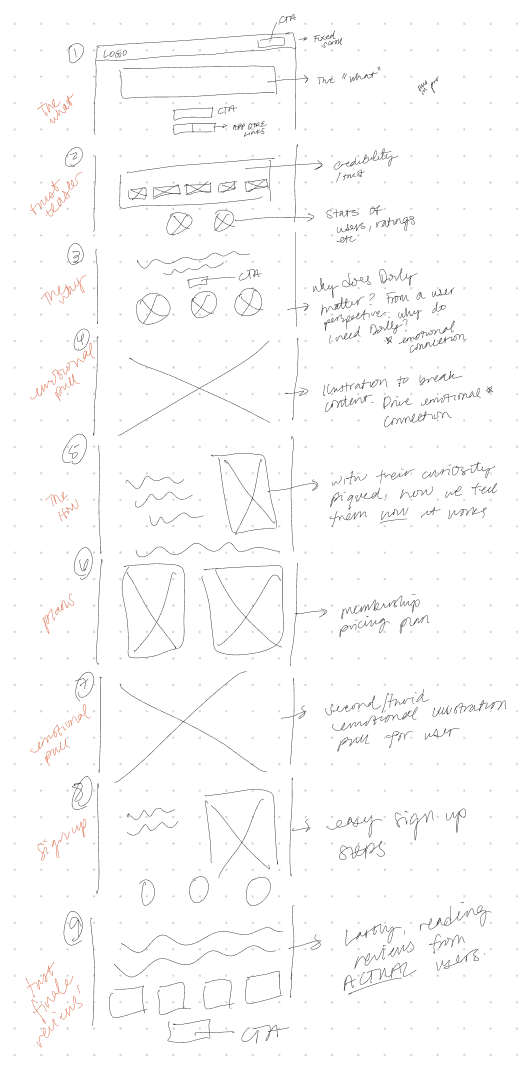
Section Strategy
With the information gathered from the audit and journey map, I sketched out sections of the page; each being meticulously placed in order to reflect a user experience journey when unfamiliar with a new product dealing with personal finances.
Over the course of a couple months, it was a constant cycle of ideation and feedback. Instead of fleshing designs fully, I worked in blocks.
While a slow start initially, this method sped the process up nearing the development stage.

Our main focus of shifting to a new design, branding, and voice is because with the many competitors out there, we didn't want to blend in and become another "boring" credit service.
Having a high credit score should be fun and exciting. After all, it is the key to achieving the many life milestones today.
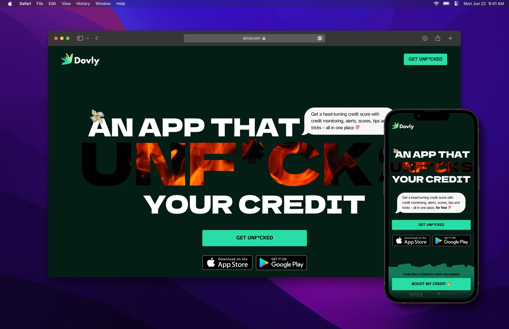
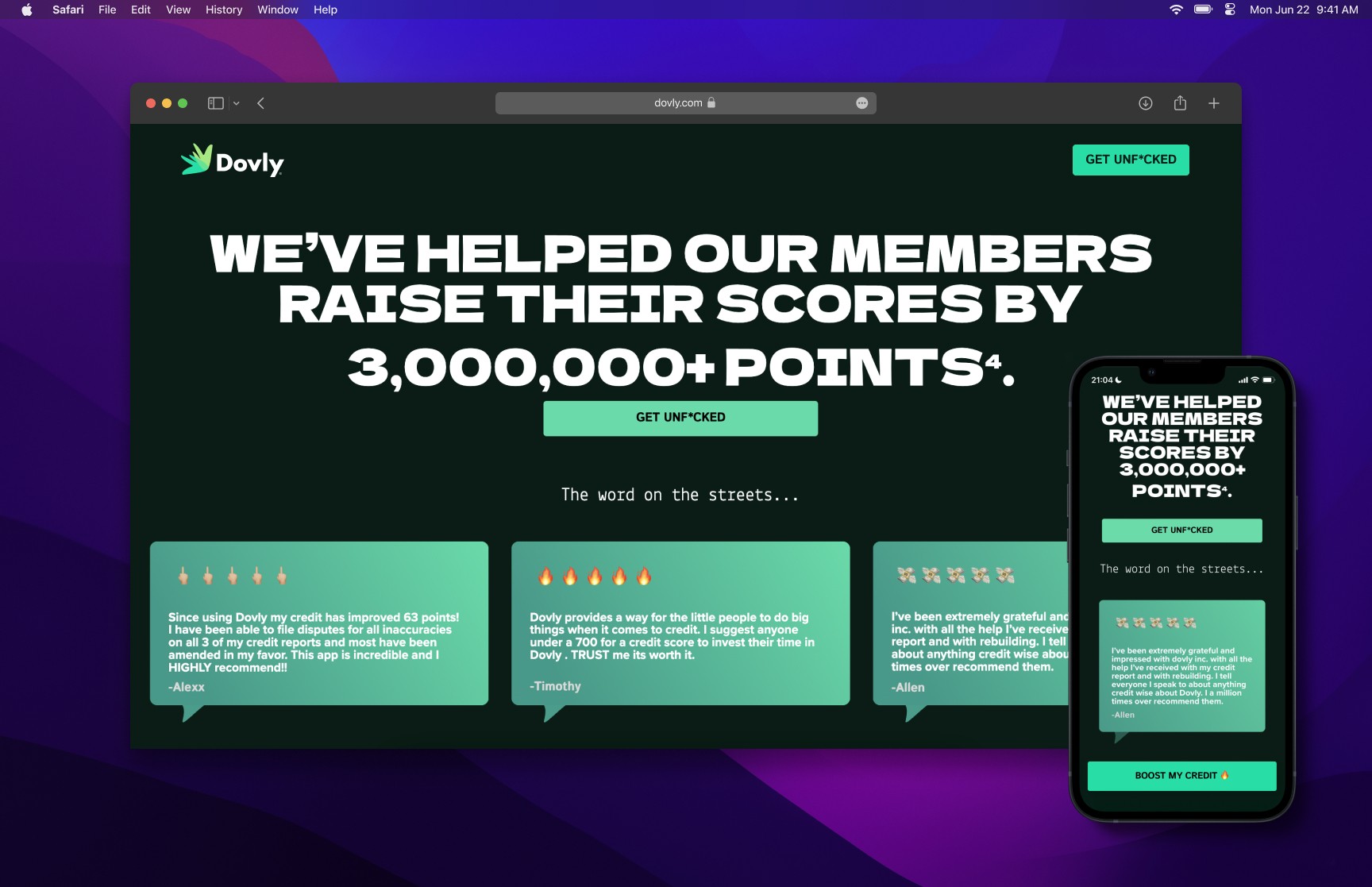
Highlighting notable companies, number of active members, and star ratings is the initial hook to keep users intrigued and builds that first stepping stone towards trust and credibility.
I tend to align with a clean, minimal aesthetic while this was bold, colorful, and edgy. I had so much fun on this redesign and proud to get out of my comfort zone.