Background
Content
What
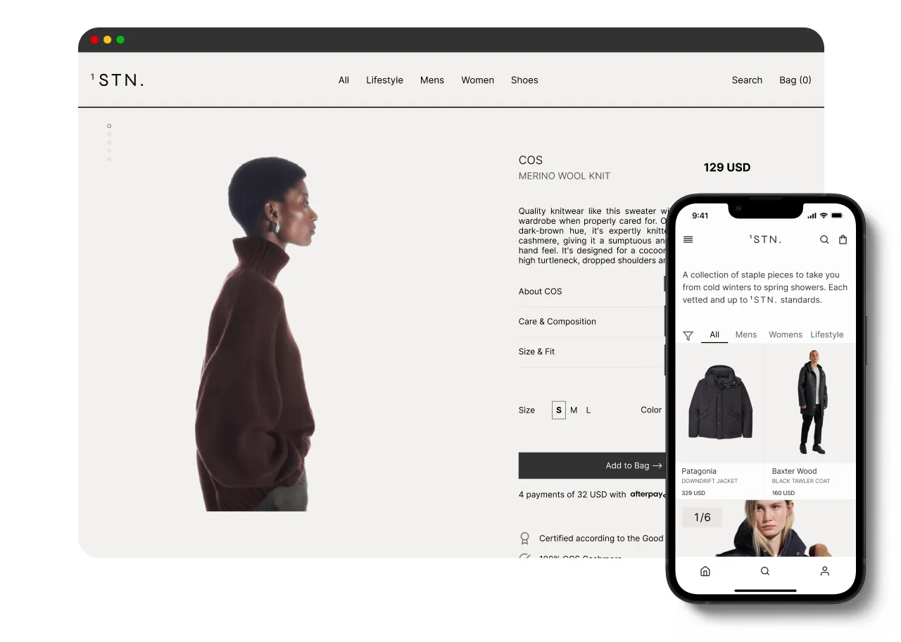
An iOS app & website that offers a curated collection of sustainable pieces from global brands all in one place.
Why
Sixty-nine percent of Vogue readers state that sustainability is an important factor when considering clothing purchases. Let’s provide a better way for consumers to shop sustainably.
User goals
A platform for consumers to easily shop and browse sustainable pieces from a variety of brands ranging from affordable to high-end
Better visibility of brand transparency, business practices, and fabric composition
Familiarity with browsing the platform for better product adaptability
Business goals
Reach 10,000 member sign-ups within 3-6 months of app launch
Onboard 150 brands from around the world
Partnership with Good on You to validate brand sustainability rating
Obtain a Certified B-Corp rating
The problem
The process for shopping sustainable fashion or lifestyle is a tedious process that users do not have the mental capacity for.
Defining
How might we maximize the availabilty of sustainable products to all users?




The current experience
Let’s say you want to shop for a sustainable overcoat — where do you look?
You go to your local thrift store and come to terms with a musty-scented coat for $15 that is no longer appealing;
You hop onto a secondhand site and are worried that this $40 pullover won’t be up to your standard when it arrives to you;
Lastly, you resort to Google where the results display the same “sustainable” black trench coats from H&M, Forever 21, and Zara; companies notorious for greenwashing practices
You continue to browse the internet and begin to feel overwhelmed by your options: ‘Are they genuinely sustainable?’ ‘Why is this coat $600?’ ‘I’ve never heard of this company’ ‘Why do all these look the same?’ *Sigh — closes browser*.
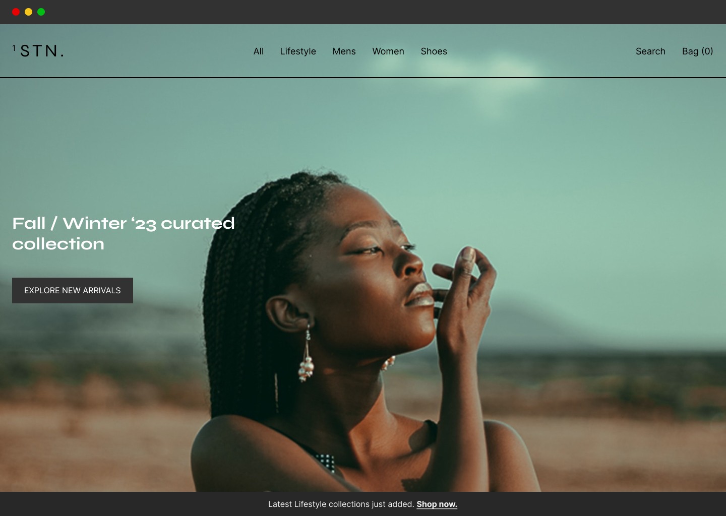
Sometimes you want a new item that isn’t pre-owned, but you want to be environmentally conscious. 1STN. is a platform that offers a curated collection of sustainable pieces from global brands — all in one place; for easier shopping, better shopping, and impactful shopping.
The design process
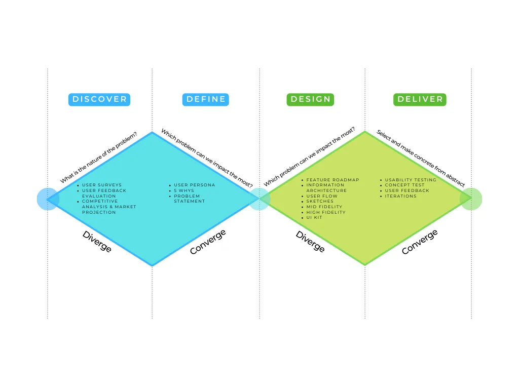
This is the design process that will be followed throughout the case study. Since this is a conceptual project, we’ll assume all variables go according to plan — let’s get started.
DISCOVER
Why should we want 1STN.?
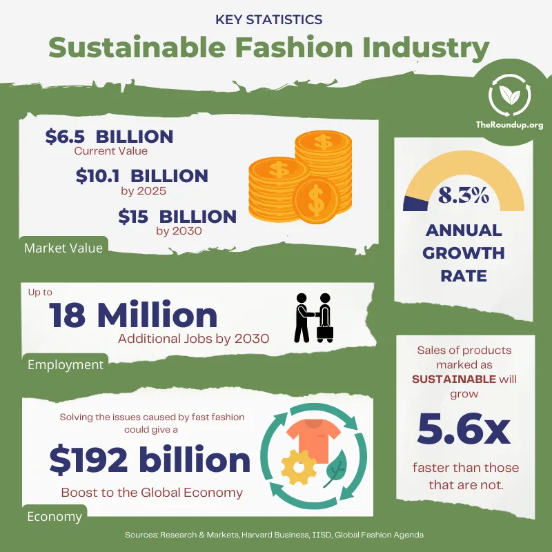
The global sustainable apparel market isn’t a fad or trend; the compound annual growth rate (CAGR) is at 9.3%
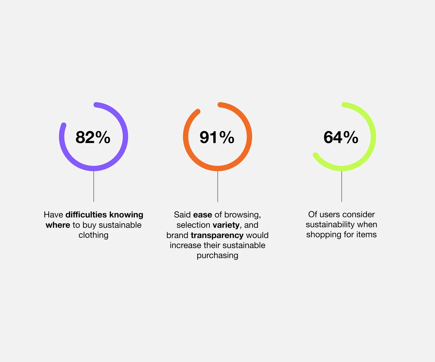
Survey says: 91% want ease of accessibility and browsing
I conducted user surveys as it is free, accessible, and dependable.
I reached a wider audience who resided from the West to the East Coast, differing living wages, surveyors from red and blue states, and accessibility to sustainable products.
Based on my surveys with 11 participants, here are my key findings.
User evaluation
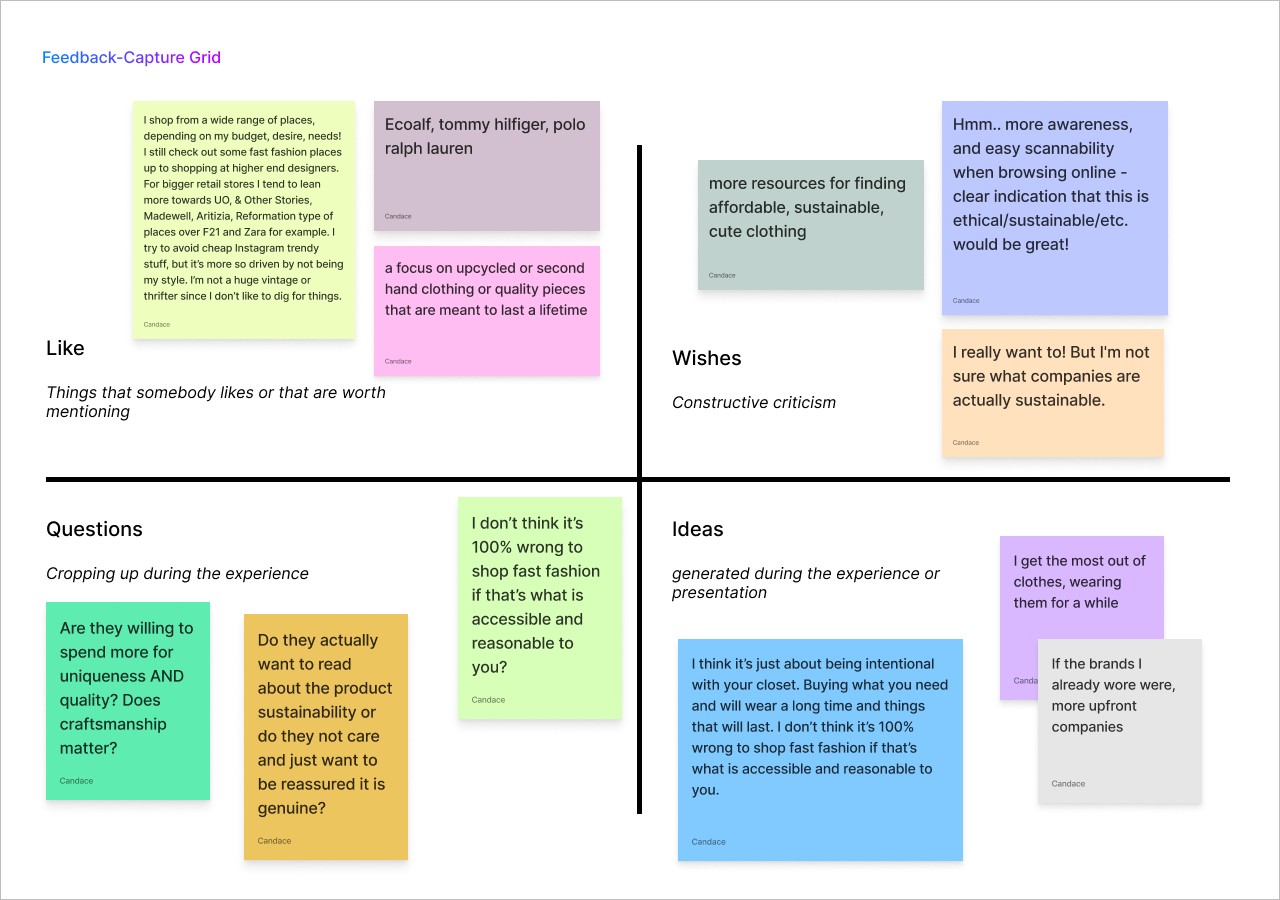
From my findings, I organized the feedback into mainthemes, and then subgroups within them. I also included feedback from in-person interviews for more substance. Click here to view the full FigJam file.
Key findings:
Majority shop at high street stores like Zara, Reformation, and Aritizia;
Users have disposable income to consider a higher price tag when it comes to shopping for quality pieces;
They are unsure of what companies are sustainable — they wish for better transparency and scannability when browsing online.
Nothing like it
It’s important that a competitive analysis was conducted to gauge the market share and opportunity for vision and growth.
So, where does 1STN. stack up in comparison to the current market competitors?
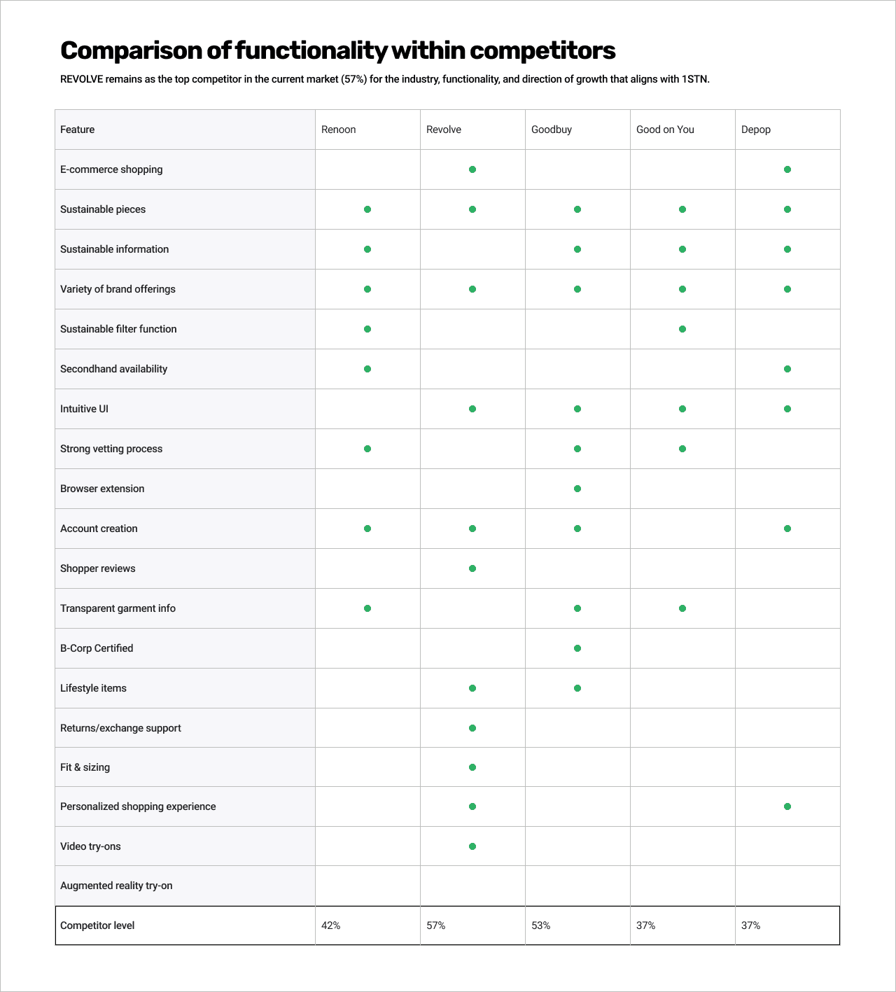
Revolve is a top competitor as it offers many features that we would like to incorporate including:
Variety of brands;
Seamless user experience;
E-commerce platform;
But where Revolve lacks are:
Lack of sustainable products;
No authentication and cross-checking into product/brand sustainability;
Making sustainable products or brands aware/visible to users;
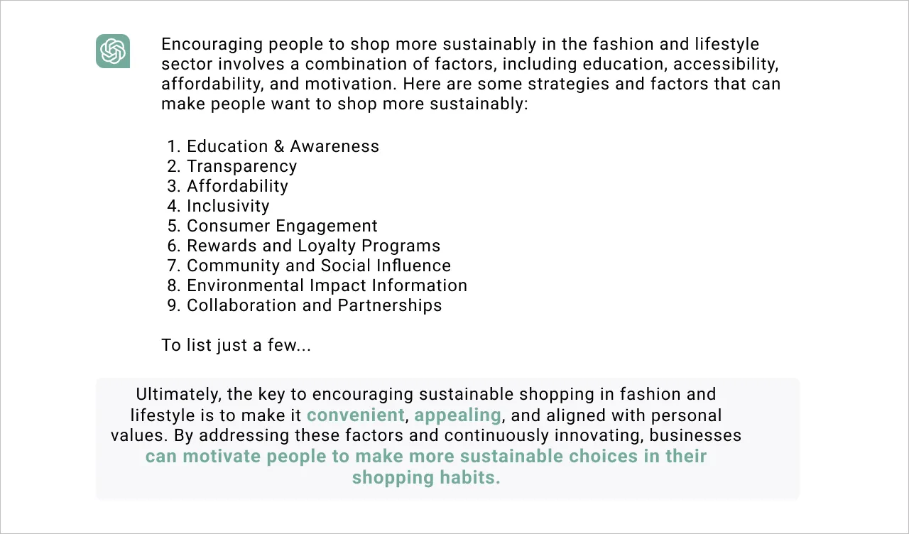
As the future gears into AI, what does Chat GPT have to say about this?
“…the key to encouraging sustainable shopping in fashion and lifestyle is to make it convenient, appealing… can motivate people to make more sustainable choices…”
DEFINE
Why is it a tedious process?
To dig deeper, I conducted a ‘5 Whys’ framework to get to the root of the problem.
It was important to understand why shopping for sustainable pieces, visibility, or transparency is so tedious for users now.
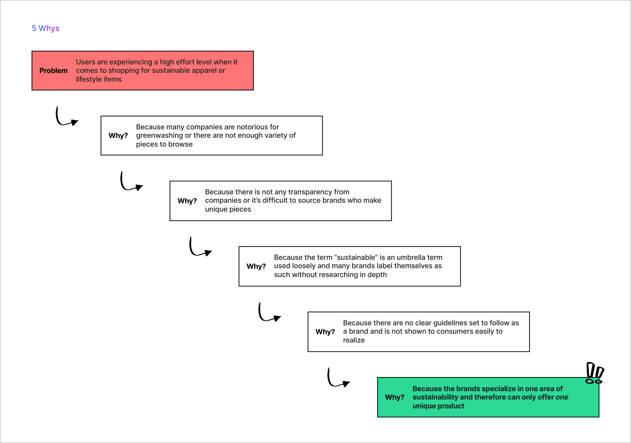
Due to the complexity and umbrella term of sustainability, I will refer to fabric sourcing and composition.
Here is what I concluded — typically, brands will start and dominate in one area of apparel:
Patagonia — started off dominating in the sustainable outerwear market
Vejas — started off specializing in casual footwear
Allbirds — started off in athletic footwear
Bomba — socks
You get the idea…
Eventually, as brands can scale, they slowly expand their offerings in other areas of apparel or lifestyle.
Let’s say the brand hasn’t been able to scale and only offers one unique product; here, users are left wanting to explore more and compare their options.
How do consumers find these products? Either they already know of the brand, word-of-mouth, or they receive targeted ad campaigns.
How might we maximize the availability of sustainable products to all users?
DESIGN
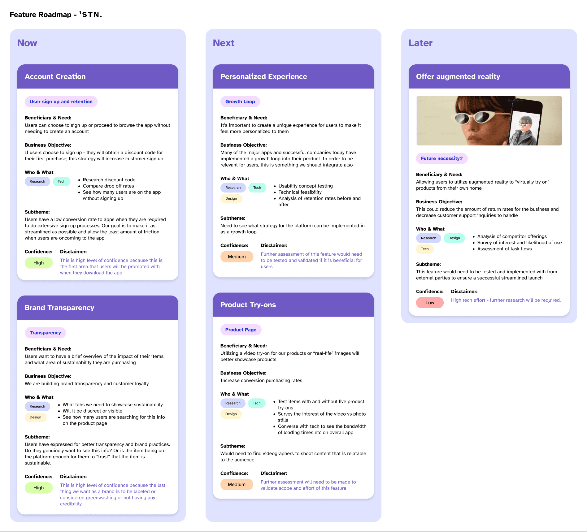
Feature roadmap
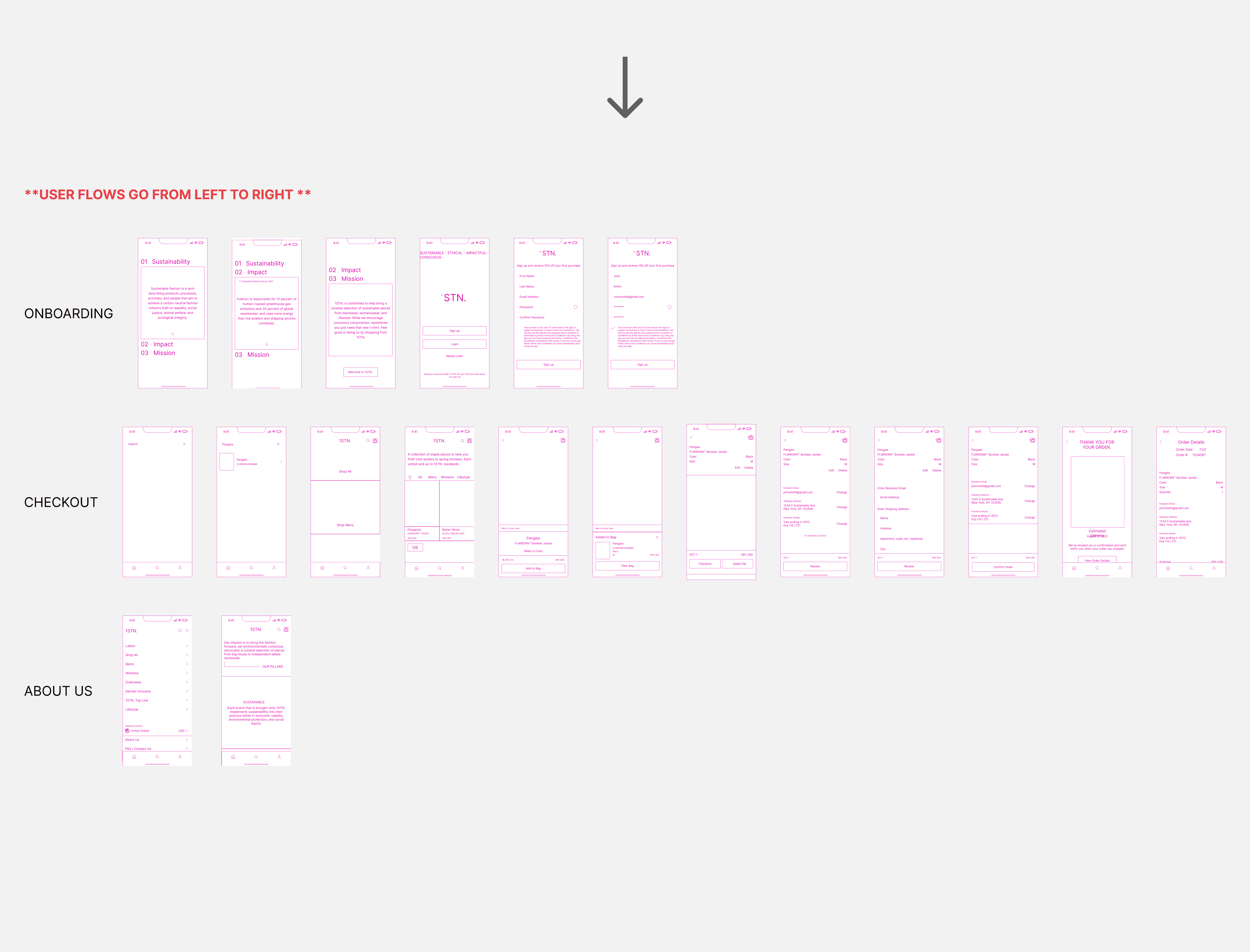
Before diving into the IA and flows of the mobile app, it was necessary to envision what the ‘must haves’ are for an optimal user experience but also consider business growth and scalability.
This gave me an overview of what to focus on first and what features could be implemented later. Please click here to view the full feature roadmap.
Prototype
I started with pen-to-paper sketches to prevent myself from trying to produce “perfectionist” work. This allowed me to draw out all the different concepts and saved me from investing a lot of time in doing this digitally.
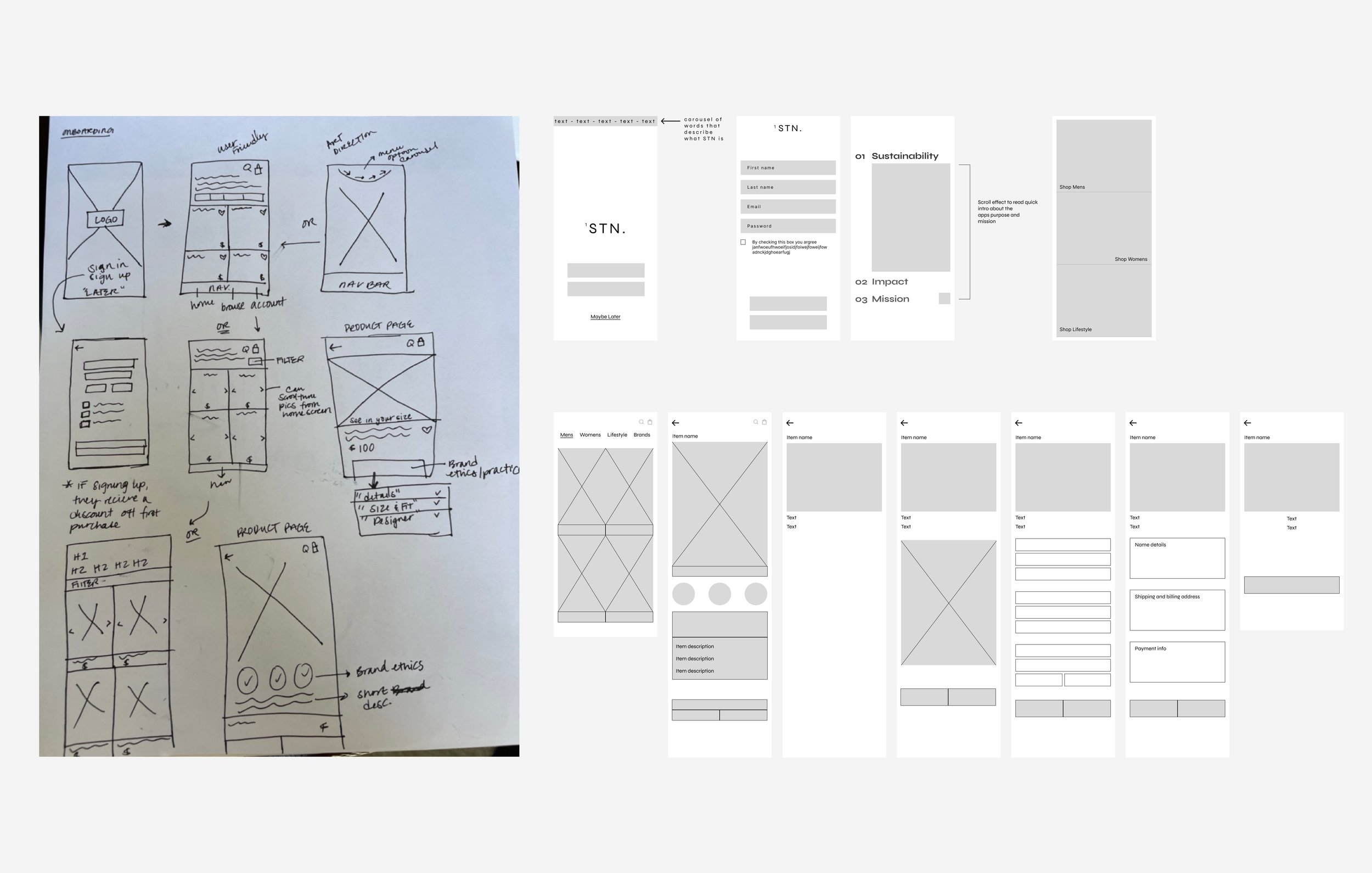
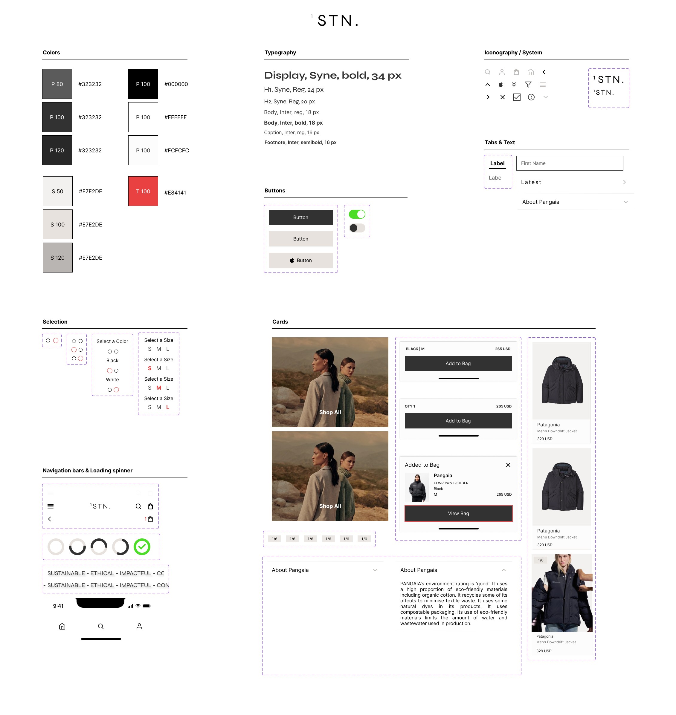
When it came time to develop the UI components, I browsed several websites and applications of brands that participants shopped at to better understand their alignment in user aesthetics. This will allow a better user experience as there are elements of familiarity throughout.
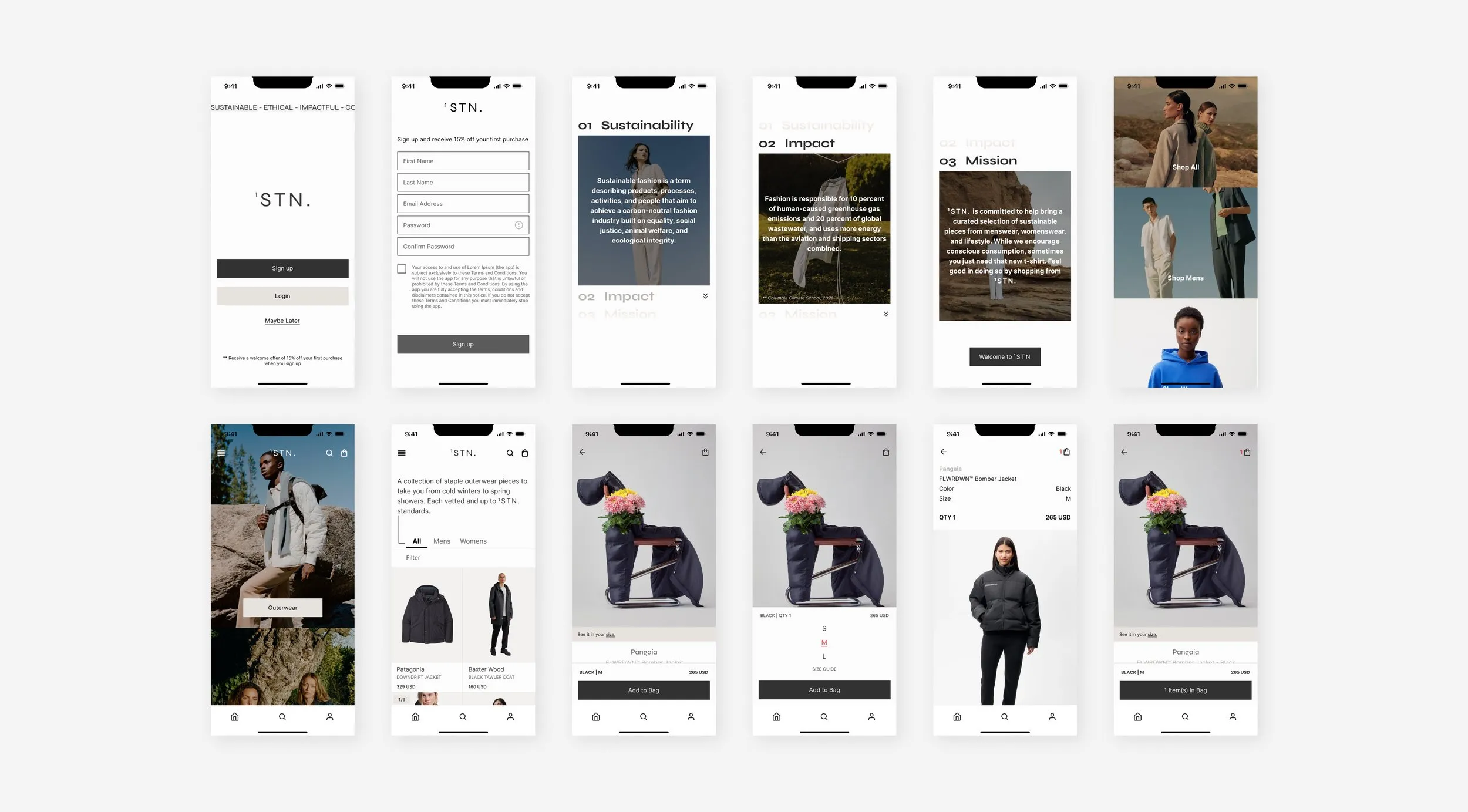
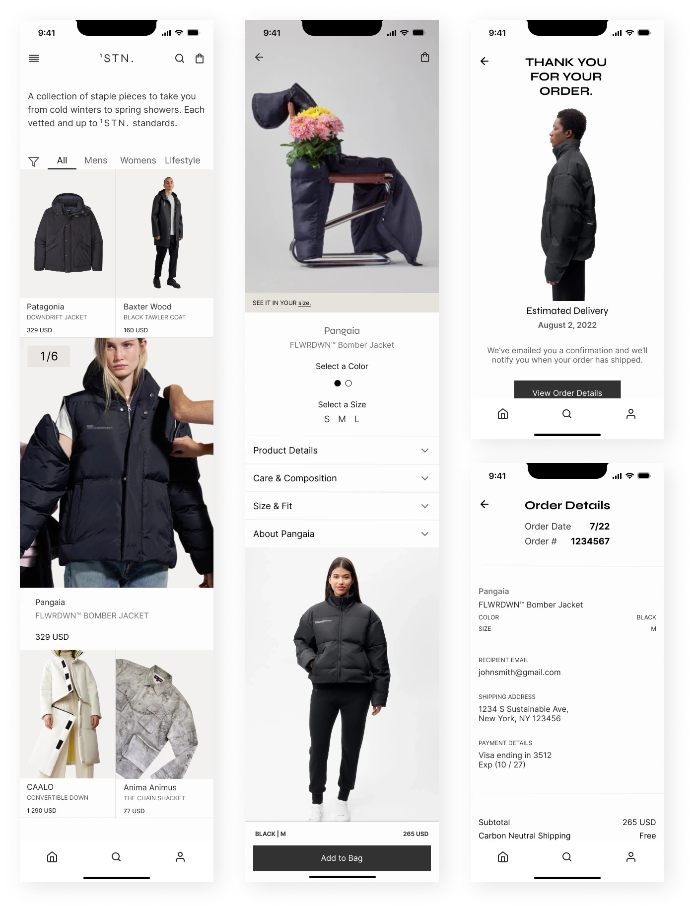
Moving onto initial high-fidelity designs, here is what I presented for group critiques and usability testing.
DELIVER
Usability testing
Two methodologies were used for usability testing: Unmoderated Remote and Moderated. Click here to view the usability test plan, as well as, reports, analysis, and prioritization.
Here are the three main problems with my initial design:
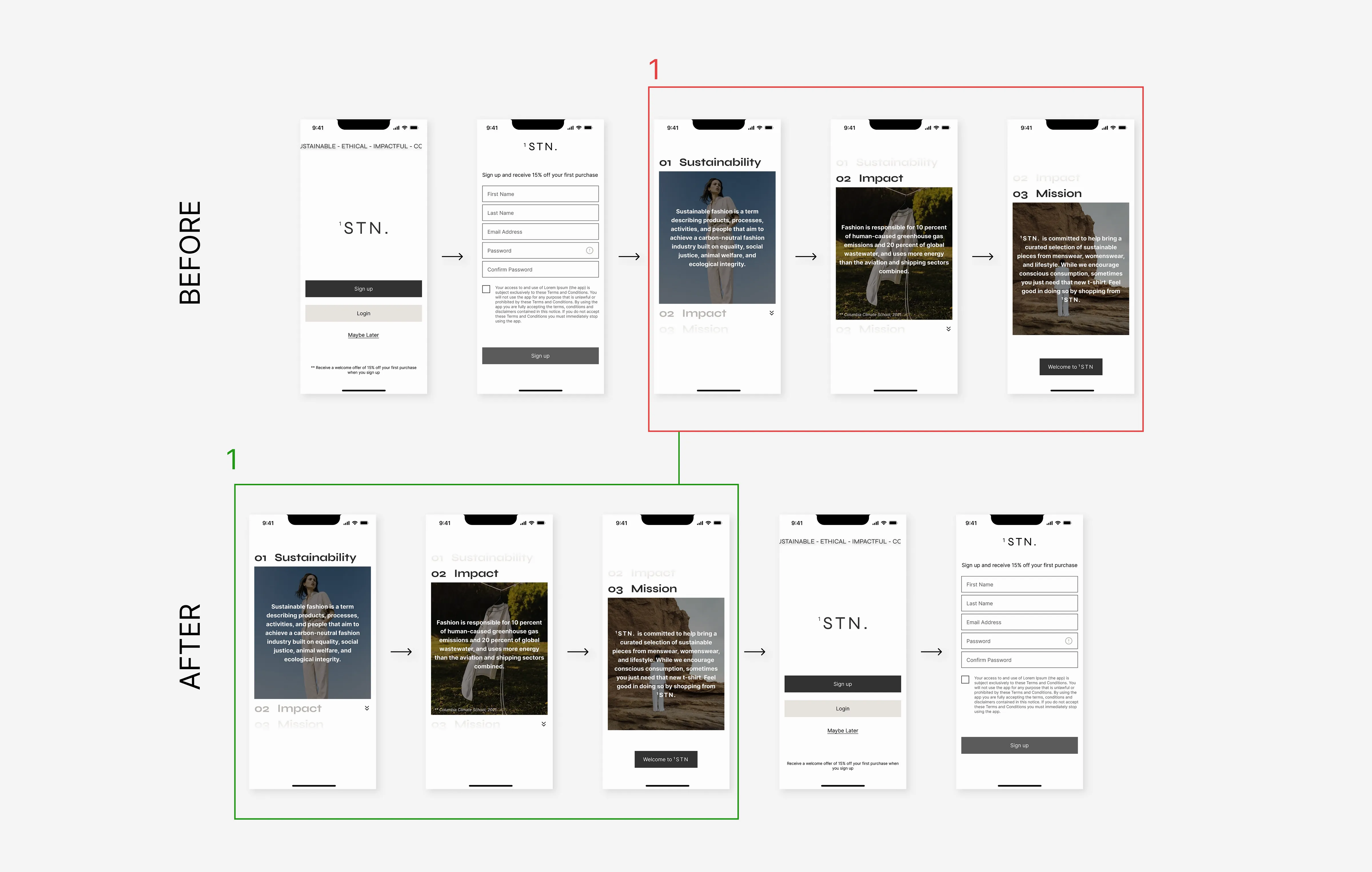
01 — Inconsistent Design Pages and Flow
During a design critique, my mentor questioned the flow of the onboarding screens. While I suggested onboarding could be exciting for users post-signup, he suggested that these should come before.
After conducting research, I noticed that companies implemented onboarding both ways. Ultimately, I took into consideration his feedback as it made the most sense.
Iteration: onboarding screens will now appear before the user is prompted to sign up to entice them and create an exciting onboarding experience
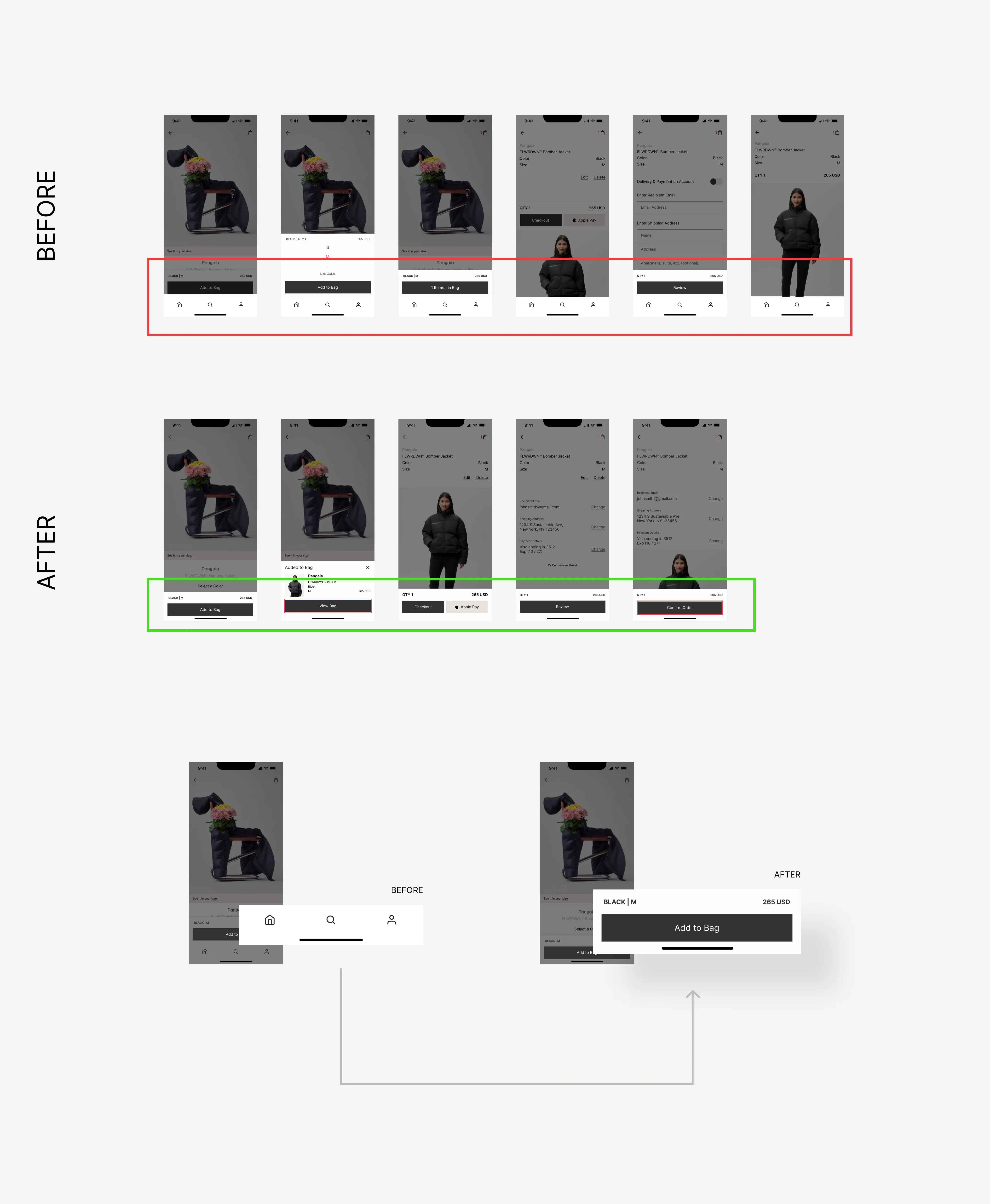
02 — Increased Possibility of Abandoned Cart Rates
During a moderated usability test, I noticed a user accidentally exited the checkout flow by tapping into the bottom navigation bar.
While this wasn’t something I was looking for in particular, it did spark curiosity about how distracting this could be as a user enters the checkout process.
Iteration: once the user chooses to view a specific product, the navigation bar is no longer apparent, encouraging the user to complete the purchase and not exit/get distracted from the product page
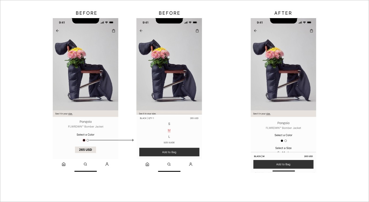
03 — User Frustration Design + Interaction
When asking users to Select a Size, the task completion rate was delayed for about half of the testers. What I thought would be an interaction that would be adopted seamlessly — was not.
BEFORE
Size selection would display once they “Add to Bag”
Delayed pop-out confirming that the item was successfully added to the bag, then auto-closing; bringing them back to the product page
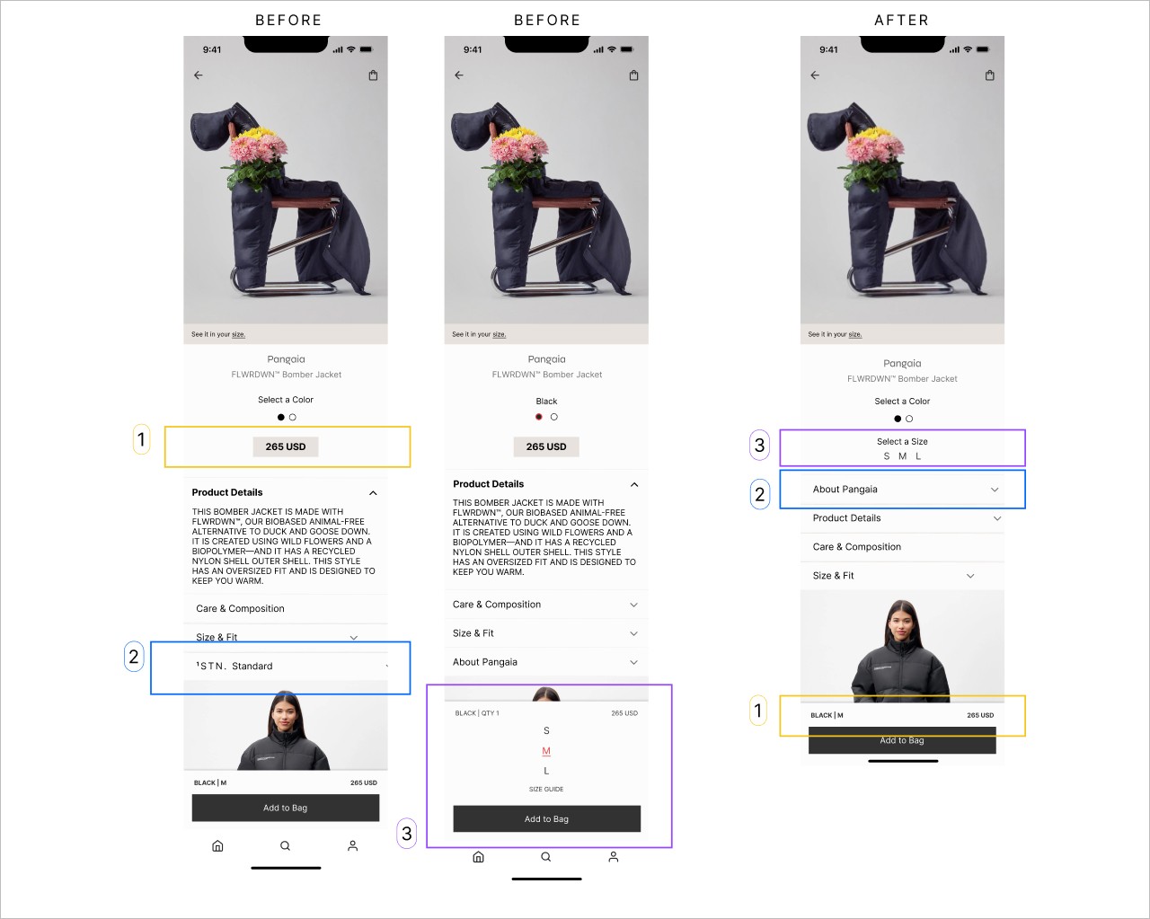
Here are some still images to compare:
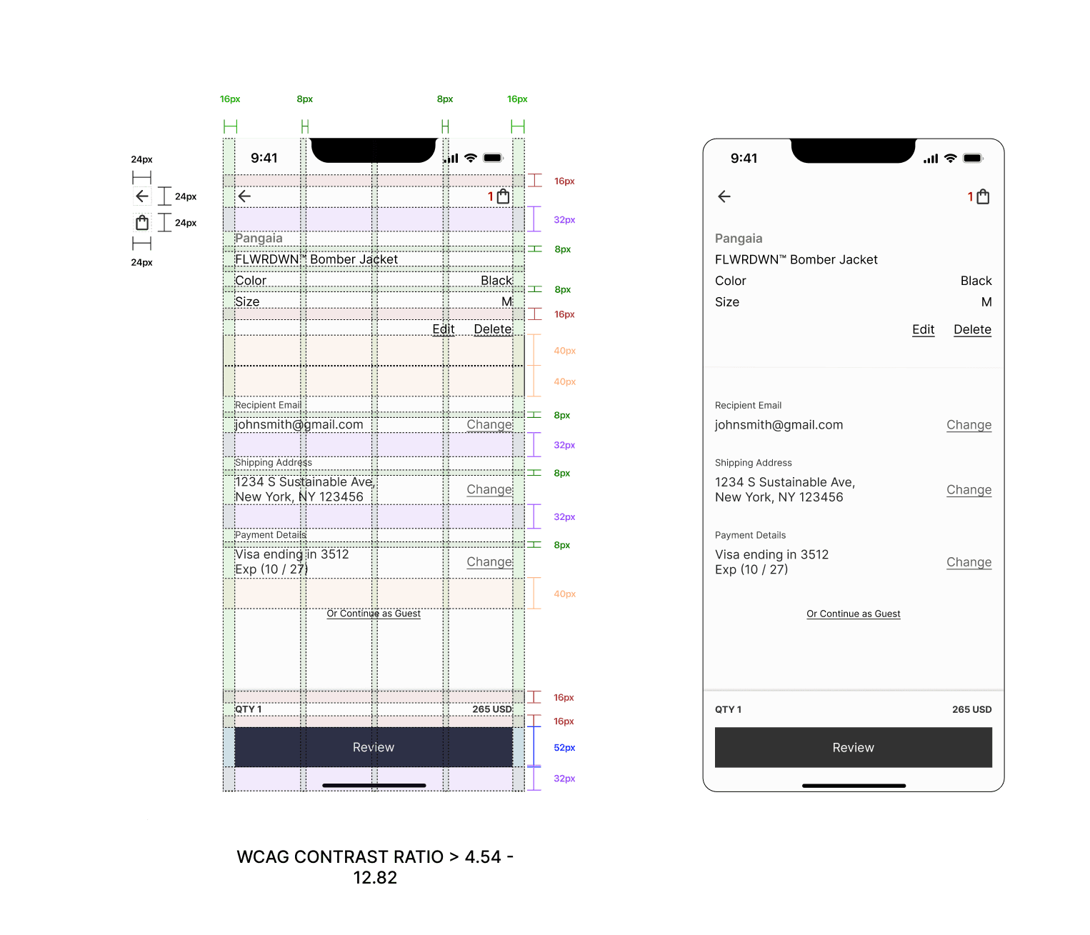
The price is now within the bottom bar for easy visibility.
Users were unaware of where to read about the product brand sustainability. I changed this from “1STN. Standard” to “About Pangaia”. When re-testing users, they did not hesitate about where to navigate.
When testing users to select a size, the majority of testers did not know to select a color first. This interaction was not a good user experience so I binned the concept overall.
I love the concept of this product. While I was working on this project, it made me wonder why there isn’t an app like this now; perhaps there are some technical constraints.
Challenges
Unexpected: Users completed onboarding screens with a variety of interactions
Learned: To reduce user and design conflict, allow a user multiple ways to interact — specifically during onboarding where user conversion is the greatest
Unexpected: Following a niche design flow from competitors will not always translate
Learned: Design familiarity is great when mass platforms have them implemented. A user journey/flow from a niche market will not always translate effectively
Unexpected: Users do not necessarily care to know about product materials or ethical brand practices. For some, it just boils down to cost-per-wear or being aware that products are sustainable
Learned: Incorporate simple and clean designs that satisfy both users who seek this information and those who don’t
Next steps
A simple visual dashboard for account users on their impact on the environment by shopping with 1STN.
Increase sustainability awareness and impact on detailed product pages
Integrate a feature that allows Account Users to resell their preloved 1STN. pieces on the app — to encourage and invest in a circular economy business model and increase market share
